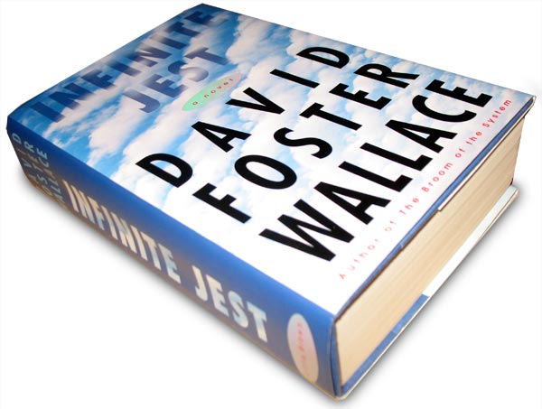
Via my friend/coworker/mentor Keith Hayes, who has three covers in AIGA's latest 50 Books/50 Covers, comes a post by Peter Mendelsund (one of my favorite non-Keith-Hayes designers) about the jacket for Infinite Jest. Mendelsund gives a great summation of what makes a good book cover:
Book jacket design should concern itself with, in my estimation, equal parts enticement ("Come buy this book") and exegesis ("This is what this book is about, more or less.") A good cover doesn't let one category trump the other. A good cover should not resort to cliché in order to accomplish either. But the real key here, in both categories (enticement and exegesis) is the designer's ability to work the sweet-spot between giving-away-the-farm, and deliberate obfuscation.
Book jackets that tell you too much, suck. Book jackets that try to change the subject also suck, and are furthermore, too easy.
Mendelsund goes on to explain why Wallace's suggestion (a design based around a photo of the making of Fritz Lang's Metropolis) would have been a huge mistake (too heavy-handed, too many cultural associations, not really what the book is about). On the other hand . . .
[. . .] a perfectly blue sky... A sky that only an advertiser could have dreamed up- a sky that could have been subsidized...A sky that stands in for satisfaction, but a satisfaction that is almost sinister in its perfection...(and, of course, HUGE type, because, well, that's just what's called for)...I think that was a very elegant solution. It tells you something very important, but leaves everything to the imagination.
What's curious about this cover in particular is that I've never quite thought about it. I judge covers all the time, but this one has always just had a sense of authority to it. I look at it and think, That is the cover for Infinite Jest, excluding in my mind the possibility of any other cover (though, in fact, there are three variations on the same theme in print). Which I suppose is a measure itself of the cover's greatness.
No comments:
Post a Comment